 |
|
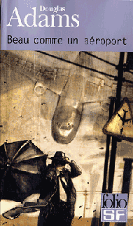
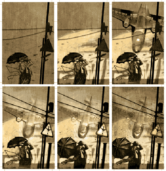
 Nicolas Botti : Did you know Douglas Adams before designing the covers? Did you enjoy this commission? And if so, why? Nicolas Botti : Did you know Douglas Adams before designing the covers? Did you enjoy this commission? And if so, why?Benjamin Carré : well, i’m a little ashamed to answer to this question... I still haven’t read his work (he had just around two weeks to make the covers). Of course I know Douglas Adams by his reputation : his legendary extravagance and the nonsense in his stories. I think that when I finally take the plunge I’ll start with his most well known work “the hitchiker’s guide to the galaxy” . NB : On your website, you show the evolution of the drawing for “the long dark tea time of the soul”? Can you comment on this for us? How did you proceed from the first ideas and first drawings to the final work? BC : The first idea was the drawing we see on the signboard “Caution Falling Aeroplanes ”. I came up with this idea with Sébastien Guillot (SF department head at french huge publisher Gallimard), we wanted to make a graphic art style like a sign : very flat, almost typographical. The idea was interesting, but we didn’t really see how to apply the same graphism to the first episode “Dirk Gently’s Holistic Detective Agency”. So, seeking some kind of harmony, I chose a little more classical font, which enhances the link between the two books. The whole picture was done with Photoshop : I began by superimposing a picture of a wrinkled sheet of paper onto another picture of striped steel... It gives this little trashy background which represents the sky in the picture. I then drew the whole scene (scenery and character) thanks to the software tools (virtual paintbrushes and airbrushes). The umbrella idea, which I drew first vertical to the private Detective, was inspired by the old Roadrunner cartoons (if I remember correctly, the coyote often hid under his umbrella when rocks fell on him). I thought it was the perfect kind of absurdity to illustrate Adams’s books.  Finally, the aeroplane (The french title "beautiful as an airport" is completely different from the original, our aim (for Sébastien and I) was not to illustrate an extract of the book, but to have a strong connection between the title and the image faithful to Douglas Adams' Mad Universe. So we stupidly thought that an airport meant necessarily some planes... To produce that image, I picked some pics on the web. My attention was drawn to a picture of an aeroplane model which served for aerodynamics tests in a giant wind tunnel. In fact, that's the plane's belly we see on the picture, so I turned it over, drew a cockpit and a tail to give the impression of a plane seen from above. The result is rather amazing : there's a realistic feeling which comes from the original picture and at the same time something completely out of phase and dreamlike. For the final touch, I put the warning signpost as a reminder of the original idea, thinking that it will just give a little more madness to the thing./tr> |
| Continue? |
 |
| Accueil / Homepage |
| Actualités I Le Guide I Le guide en Francais I Série radio en Francais |
| Extras I Douglas Adams I Mises à jour Liens I Contact |